These rankings are of the whole helmet, so clearly, logo plays a factor in this biz.
 The Worst Helmet in Football
32. Cleveland Browns
Not much to say about this one. It's one color, it's dumb as hell. Get more creative, Browns. Isn't it bad enough that your fans have to root for this team on the field, but then they don't even get a helmet that can be differentiated from one that would be worn in a football movie that didn't get the rights from the NFL to use any actual team names? I mean, geez, even T.C. Williams had numbers on their helmets in Remember the Titans and they were a high school team! You are a disgrace to the NFL, but you are not a disgrace to the city of Cleveland, because nothing could disgrace that garbage city!
 Simplicity (Not in a Good Way)
31. New York Giants
30. Indianapolis Colts

These two are just super boring. The Giants logo is as plain as plain can be, everyone gets that. Blue on Red with lame light gray facemask. And the Colts helmet is just super plain. White helmets are hard to make extra interesting as it is, but the Colts really take it to a new level of boring. You have so many horse-related options to use on your helmet, and all the Indy fans get to look at every week is this horseshoe. When Indy wears their white jerseys and white pants, they look like a picture of football pre-color photography. This Colts helmet would really look a whole lot better with a blue facemask.
 I Like the Innovative Spirit
29. Jacksonville Jaguars
This helmet is kind of a shame because the Jags logo is awesome. They incorporate their signature Teal in the Jag's eye, nose, and tongue. If they had picked just one color for the shell, either the gold or the black, it would look great, but this fade just doesn't work. Not to discourage the Jags though, because NFL jerseys in general can use as much innovative thinking as possible. I like what you're thinking Jacksonville, just not quite there with this one. But please keep trying! Your colors are awesome! There is good that can be done here!
Simplicity (Not in a Good Way) Pt. 2: Dyspeptic Boogaloo
 28. New York Jets
 27. Arizona Cardinals
 These are ugly for the same reason as the Colts. Just boring plain white. While the Jets do have the nice green facemask, their logo is so boring and old timey, so I gave the Cardinals the slight edge here. The Cards' logo is pretty cool, I like red birds, and they at least have some edge, some anger on there! Some aggression! The Jets have their name and a football. This raises a bigger question: why do the Jets not have any airplane imagery in any of their team equipment? Winnipeg does it right. For shame New Jersey Jets, for shame!
26. Washington Redskins
This Helmet is actually pretty sweet. My high school's colors were Maroon, Gold, and White (Go Porters!), so I have always had a soft spot for that scheme. The gold face mask is a perfect pair with the gold stripe down the middle and the gold highlights in the logo border and the tail feathers. BUT, it's also super racist, and since I fashion myself to be a rather progressive fellow, I didn't think it would be fair to rank this helmet any higher than this spot. Washington needs to change it's team name, and when they become the Washington Warriors, they should go back to using this helmet.
 It's A Shape
25. Dallas Cowboys
Look at it. What do I really need to say? The Cowboys' color scheme is mad boring. Dark Blue on Silver. Silver facemask. And a blue star. I will give them credit that this helmet does go well with their uniforms, but, this league has a lot of dynamic helmets, and this just isn't one of them.
 They Only Work in Profile
 24. Philadelphia Eagles
23. Seattle Seahawks
Looking at those pictures over there, these look like two fine helmets (although that picture of the Seattle helmet is not the greatest, I couldn't find a straight-up profile of that one with a white background). And in fact, they are two fine helmets when viewed in two dimensions as we are doing here. But, unfortunately, football is played in three dimensions, which means that when people watch the Eagles play the Seahawks, they will get angles like this where it looks like the Seahawks have two weird tubes with bird heads at the end wrapping around the back of their heads and the Eagles look like they have angel wings sprouting from their foreheads. Of course, the Eagles will probably never change their helmets, but the Sixers did have a big costume change lately, so there is hope. Seattle just needs to go with a straight up neon helmet and put a picture of a full bird up on that thing.
 Nice Colors, Dumb Logo
22. Green Bay Packers
This low ranking is strictly an indictment on the logo of Green Bay. First off, it looks super dated. Second, I am not a huge fan of using just one letter on a helmet, let alone just one letter to represent a city that has two names. Where's the B? It should be GB! Third, this logo has been used by so many other teams (Georgia, most notoriously) that it hardly signifies the Packers in any meaningful way. I do love the colors, though, considering the Pack is the only current Big Four team that uses Green, Gold, and White (RIP Sonics). I am not sure what would be a better logo, but you've been running this G out since 1961, let's all put our minds together and see what we can replace it with! (Totally Biased Side Note: Aaron Rodgers, please die.)
 The Cheese Pizza Group
21. Houston Texans
20. Carolina Panthers
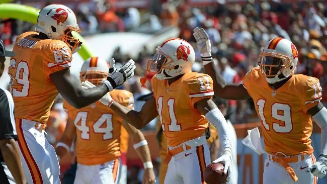
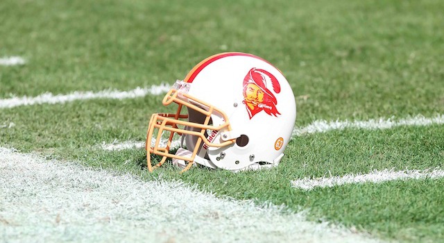
19. Tampa Bay Buccaneers
From here on out, I like the rest of the helmets pretty much. The distance between 21 and 10 is much smaller than the distance between 32 and 22. Much like Cheese Pizza, which is delicious but is by no means anything fancy, these three helmets are nice. There's nothing wrong with them, and there's nothing that stands out too much.
The Texans are patriotic, which everyone knows is really boring, and their name is really stupid. But they make up with it with their badass Bull logo (although obviously not the best Bull in the logo business) which helps to distract from the redundancy of their stupid name.
The Panthers have an awesome logo also, with their signature blue and accenting the black fur. I think it's just how blasé the grey/silver color of the shell is. Still, a fine helmet.
Finally, Tampa's helmet is kind of something special, in that it's logo is so effing big! I once again tip my hat to any team who gets innovative with their uniforms, and I love the gigantic flag, I love the pewter shell. I have no complaints about this one. Although I also wouldn't have any complaints if the went back to the creamsicle unis and those beautiful helmets.
 Bias Alert!
18. Chicago Bears
I love Blue and Orange. I went to University of Illinois, I root for the Bears. Blue and Orange run through various parts of my body. And this helmet is a beauty. But, in the same vein as my rant on the Packers, I don't much like the how generic the Bears C is. It is identical to the Cincinnati Reds logo, and also seven million different high schools from places like Crestwood and Canyon Springs or whatever. Two very simple solutions to get this helmet to be in the top five: 1) Change the face mask to Orange, 2) Change the C to the Roaring Bear. Boom! Fixed! Next!
 The Silver Dynamo
17. Detroit Lions
I am giving the title of the Best Silver Shell helmet to the Detroit Lions. I'm not a huge fan of the silver shell, in the same way that I am not a fan of the white shell; I think it's too plain. Detroit does it right with the black facemask though, and the Lion logo is awesome. This helmet belongs in the Cheese Pizza category, but sometimes you make rankings and they don't fall into neat little piles like you want. Unlike this next group....
 White Lightning: The White Shells Glory Story
16. San Diego Chargers
15. Tennessee Titans
14. Miami Dolphins
13. Buffalo Bills
 White shells are boring....BUT there are still ways to use them successfully. These four are the best white cream of the white crop. (Wrote that sentence strictly so I could include the term "White Cream" in my helmet rankings.)
First, the San Diego Chargers, with really, a very understated helmet. We've seen these same helmets in dark blue in the past and the white shell is definitely an improvement. Not much to fix here, it's just a simple helmet with a simple logo to go with it.
 Second, we have the Tennessee Titans helmet. I like their logo, even if it is just a fancy T. The Titans have awesome colors, and the logo highlights all of them, even the red that they never utilize. I like this helmet on its own, but I also like how well it matches with the uniforms, the light blue accent on the helmet matching the blue on the shoulders of the jersey. We all miss you Steve McNair!
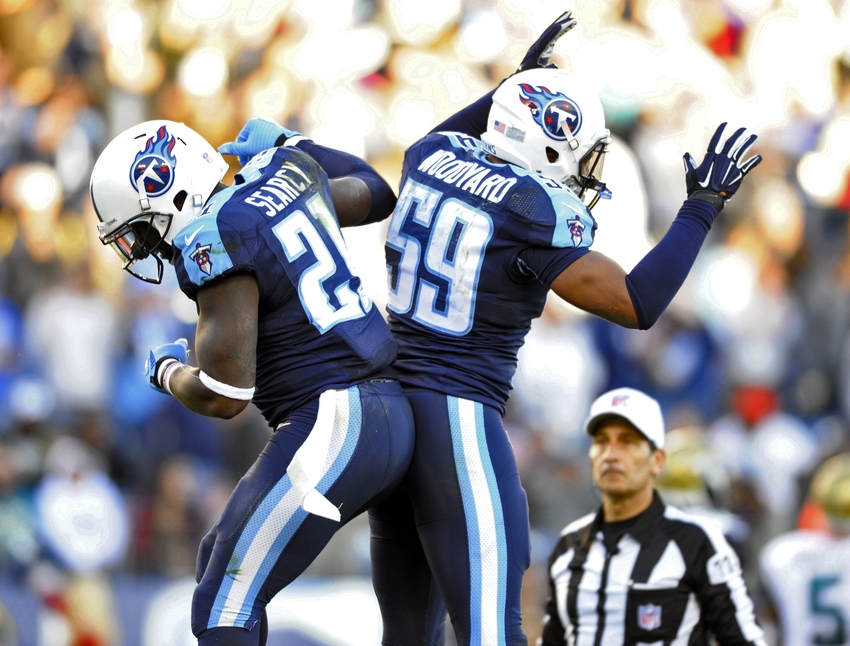
 The Dolphins recently made a change to their logo, and honestly, I don't think it really had any effect on the aesthetic of the helmet. So the Dolphin doesn't have its own little helmet anymore? Are we not going to realize that these are the Football Dolphins anymore? Nah. The new logo is sleek. I mean, sure, the last logo was great, and the new one is kind of generic. Whatever, they are equal in my mind. Let's move on. (Dolphins colors are fucking baller, btw).
And at number 13, we have officially reached the best White Shell Helmet, belonging to the Buffalo Bills! I love how big the logo is. The Bills have never really had a bad helmet. But the real winner here is the logo; the Bills logo is just really, really great. You can't go wrong with that beautiful Laser Buffalo. While it seems we may never see a successful Bills team on the field, we will at least always be graced by their ephemeral beauty.
 The Human Heads on Human Heads
12. Oakland Raiders
11. New England Patriots
 The Raiders are badasses. Their colors are Black, White, and Silver. Doesn't get much cooler than that (take note, White Sox, Black and White ain't enough!). Their logo has been around since the sixties, and it's still cool. Old pirate dude with an old-timey helmet, swords in the back. If we have learned anything from Johnny Depp, it's that we as a people freaking love pirates, and it turns out that I am no different. Don't change nothing bout these helmets Raiders!......(Unless they want to change that facemask to black, but I'm just thinking out loud here.)
Three words for the Patriots' Helmet: Red....Face....Mask. That face mask is so amazing. The logo is half decent as well, and it definitely is improved by being gigantic across the side, but the real winner is the red face mask. It's amazing. It makes this helmet amazing and it makes the rest of their ho-hum jersey repertoire a bit improved. They could do with bringing back the red throwbacks.
Welcome to the Top Ten helmets! These are the creme de la creme. All of these are glorious, and if these teams should feel like they have accomplished anything at all, they at least have beautiful helmets.
 The Four Section Helmets
10. New Orleans Saints
09. Pittsburgh Steelers
 The Saints and Steelers helmets are very similar: black facemask, logo that is essentially a glorified four point star, beautiful solid color shell. They both utilize their best color combination. I kept trying to put the Saints worse and worse on the list, mainly because the Fleur-de-lis is super boring, but the gold shell is really awesome, so they made it in to the top ten basically just on that.
The Steelers' Helmet, on the other hand, made it in to the nine spot based on a bunch of stuff. The black on black with the facemask and shell works really well. The cool looking logo (with a dumb backstory: the three different colors represent the three minerals in steel) has two colors in it (red and blue) that are not a part of the Steelers color scheme at all, a feature shared only by the Titans (whose red has only ever manifested itself as this fugly red Oilers dedication/abomination) and the Ravens (we'll get to them later). Additionally, black and yellow are just a good combo; something the entire city of Pittsburgh really appreciates.
 The Filthy Animals
08. Los Angeles Rams
07. Baltimore Ravens
06. Denver Broncos
 The Rams have a pretty great helmet. The color combo of gold and blue is very nice, and I am especially partial to helmets that are not trying to actually be helmets but rather are representing something else entirely. For instance, what we have here are a beautiful pair of golden ram's horns protruding from the skull of every LA Ram. It's glorious, there's two more helmets similar in style to this one, and they are topping the list. Keep up the helmet game Rams (Change everything else. Your team is a fucking joke).
 Wow, so while I was doing research on the Ravens helmet, I discovered what their helmets used to look like. I can't even remember this jersey/helmet combo. This is the perfect case study of how a logo centered around a letter can succeed and fail. If you are going to put the first letter of your team name on the helmet, either do it crafty like the Titans did (you can hardly even tell it's a T) or bring an animal into the picture somehow. It worked for the old Broncos' helmets, and it works for the current Ravens configuration. Also, they rock the red eye on the Raven which has nothing to do with their colors. Pointless, but interesting.
Have I mentioned my love of Orange and Blue combos. The Broncos are not shy about jersey and helmet changes. But whatever they do, there's always a good amount of orange being represented and that is definitely the way to go. Football is pretty well set on orange teams, but basketball, get with it! Give us some orange! The Knicks are not enough! Anyway, the Broncos have a baller logo, that horse looks pissed, and he's got those mad neck veins (or she's got, Femanism 4 Lyfe!). Dark blue helmet, awesome logo, dark facemask. It all works.
 Various Shades of Red
5. San Francisco 49ers
4. Kansas City Chiefs
3. Atlanta Falcons
 The 49ers have what the Saints should be striving for: they use gold with an actual color instead of black. Get smart, New Orleans! If you use gold as the accent to a bolder color, it looks much better than using black as the accent, and gold as the main color. As far as logos go, I will admit that my love of the Niners' helmets does go against my railing about bland letter presentation, but sometimes there are exceptions to the rule, and the color scheme trumps the plainness of the logo's bare bones. Red and Gold, Ride or Die!
At Four, we have another team that has its city's letters in its logo but the Chiefs have something that no other team in football has: A RED SHELL. The red helmet is a thing of beauty. The Chiefs logo is fine, and the white facemask is a good compliment to the logo. As a two color helmet, it has the perfect distribution of the white on the red. It's just a great thing to look at.
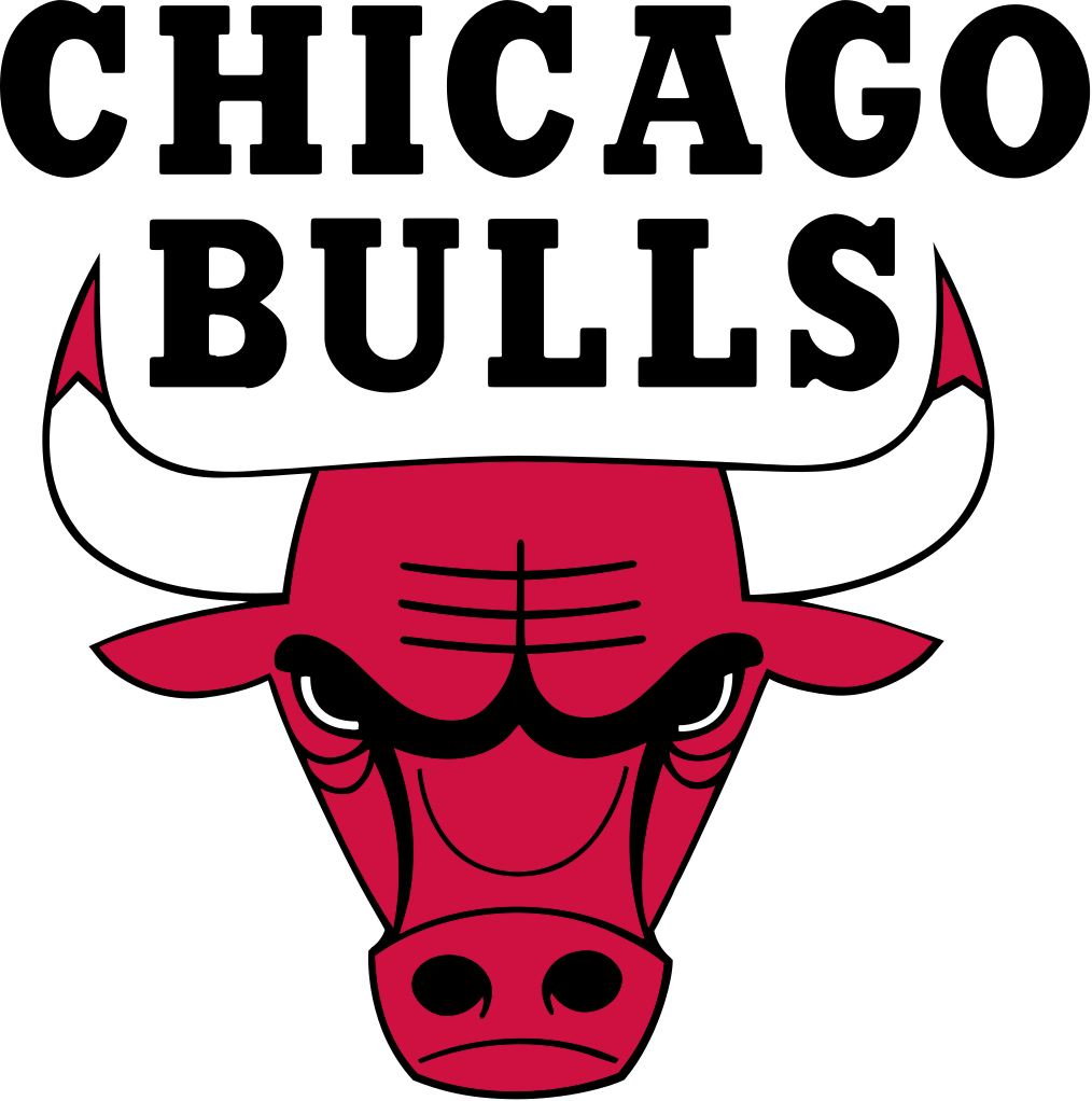
The Falcons come it at number three because black helmets with black fasemasks are inherently badass. Also because their logo is really cool. Really, having black, red, and white as your colors, you are putting yourself into a good situation. Just ask the Bulls, or you could ask the Bulls, or if those guys don't tell you about that color scheme, you should go ahead and ask the Bulls. The logo is menacing and has the perfect amount of red in it. What if they had red facemasks, too? That would be amazing.

Almost The Greatest
2. Minnesota Vikings
The Vikings have so much going for them, it would have been near impossible for them to not make the top five. Their name is awesome and totally appropriate to the tundra that they live in. They have a purple shell. And they have been rocking the same helmet for their entire 55 year existence because it is perfect. There's no dumb M on the side, there's no V to tell you they are vikings. There's a damn horn sticking out both sides, and when you see it you know that they are the Vikings, because only Vikings would sit outside in December with no shirt on, rocking the horns, possibly catching hypothermia. Luckily for those dummies, their new stadium has a roof, but still, these are glorious helmets.

The Actual Greatest Helmet (For Now)
1. Cincinnati Bengals
The fact that this helmet is my favorite helmet and the helmet that I ranked worst is basically the exact same helmet, except the Browns have a stripe down the middle, and the Bengals have the tiger stripes, should show how easy it is to fuck up your helmet. The Bengals don't need to tell you that they are from Cincinnati (probably because they don't want you to know or because they are too stupid to spell their own city's name). They just stripe it up and you know what's up: you are probably about to see a ginger throw an interception, but damn will he look fine doing it. That ex-felon playing cornerback, he looks nice in Black and Orange. Damn nice! Keep up the high quality of football wear, Bengals!
No comments:
Post a Comment